Our Own Brand Refresh Process

Five years ago, we “got legit.” We rebranded Hoffbeck + Co with the help of a designer and built a brand we were proud of—bold, collaborative, clear.
But businesses, just like the people who run them, evolve. We’ve gotten more clear about where we’re headed, who we serve and how we work. And we knew it was time for our brand to reflect that.
So here’s the scoop behind our refresh — why and what changed.
Logo Insignia With More Depth + Meaning

The new insignia keeps our signature “+” but adds more dimension and movement. By adding the gradation to the intertwined letterforms this added depth and amplified the plus sign, a representation of our collaborative approach. The aim was to strengthen and reinforce what Hoffbeck + Co has always stood for:
Strategy + Creativity
People + Process
Bold ideas + Thoughtful Execution
We wanted the insignia of our logo itself to say this louder.
New Logotype That’s More Aligned With Our Present + Future

We simplified the name from “HOFFBECK + COMPANY” to “Hoffbeck + Co.” and switched from all-caps to sentence case. It’s a small move with a big energy shift.
It’s still strong and bold. But now it feels more open, human, grounded, aligned with how we show up in the work we do. The goal was to keep it bold, but make it feel more approachable. We love this update.
Expanded Color Palette

We’re doubled-down on our core brand color: neon teal. But we added a few new shades of gray to give us more flexibility across branded materials.
These additions let us play with contrast, create hierarchy, and keep everything feeling layered but cohesive.
Fonts That Match the Fresh Feel
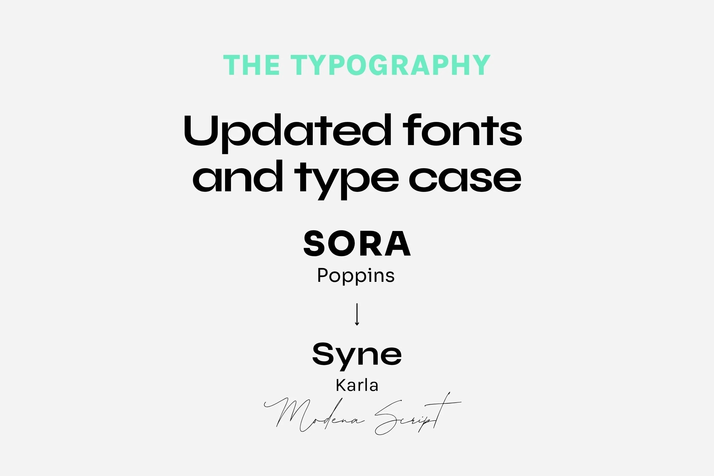
We said goodbye to Sora and Poppins and introduced Syne and Karla — a font duo that better matches our tone: confident, warm, and a little edgy.
Syne brings bold structure with personality.
Karla adds a grounded, authentic feel that pairs beautifully with Syne
Modena Script was a handwritten, script font we had with our original branding, but we loved it so much we wanted to keep that one, which gives a raw, authentic feel.
Switching to sentence case across our brand also creates a more approachable vibe without losing any punch. The font changes made a big impact on the overall look and feel of our brand – maintaining that bold, edginess yet feeling much more approachable – and practically speaking, making our copy much easier to read in most cases.
The power of typography choice and pairings… massive!
Patterns That Reinforce the Brand

To extend our visual identity, we designed custom patterns using the plus sign as a repeating element. You’ll be seeing more and more of these patterns showing up across our branded assets from our website to social media.
It’s just one more way we’re anchoring the brand in something that feels consistent and creative. Plus, (pun intended), they’re just fun!
Same Us, Just More Dialed In

This refresh isn’t a reinvention. It’s a realignment. We’re still Hoffbeck + Co — collaborative, bold, committed to doing great work for and with our clients. Now we just look even more like ourselves as we do it. ;)
✨ Need help refreshing your own brand? Schedule a free call here or DM us—we’d love to help.

More soon,
Lane + Mahla
CONSULTANTS + PARTNERS
Subscribe to get our rowdy business blog — with strategy, finance, and marketing insights — dropped straight into your inbox.